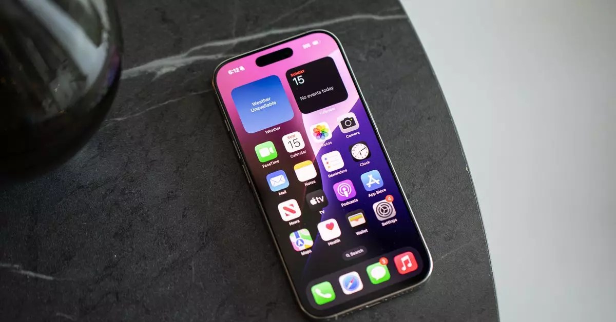
In the age of smartphones, our handsets have become extensions of ourselves, housing everything from our schedules and communications to entertainment and shopping. However, as the years have rolled by, many users have started experiencing the unsettling weight of app overload. The homescreen of our devices — once an organized grid of necessary applications — can quickly morph into a chaotic jumble of icons, each vying for our attention. This digital clutter can feel oppressive, particularly as we accumulate apps that we seldom utilize. When I gained access to a new iPhone recently, I found myself staring at a sea of icons. Sixty of them, to be exact, all jostling for space on my homescreen. It was overwhelming, to say the least.
In contrast, Android users often enjoy the advantage of a much more flexible approach to app management. The option to utilize an app drawer allows them to relinquish the pressure of maintaining a clean homescreen layout, keeping undesired clutter at bay. The introduction of app hiding and the app library in iOS 14 provided some relief, creating an opportunity to escape from the grid’s relentless glare. However, as iOS continues to evolve – especially with iOS 18’s new features – many users are still tethered to a mindset that revolves around the incessant barrage of app icons.
Compelled to regain control over my digital space, I undertook an experiment: a meticulous reorganization of my homescreen layout. The objective was simple yet profound — to strip away the excess and curate a clean, functional homescreen. I devoted an hour to this process, eliminating unnecessary apps, arranging widgets for efficiency, and revamping how I interact with my device. As I deconstructed my homescreen, I felt an exhilarating sense of liberation. What once felt suffocating transformed into a minimalist haven.
This new layout was leaner and more functional. I curated my app selections with precision, maintaining only those that served me effectively. Many third-party apps — valid once — were unceremoniously removed, taking away their long-held space, which now felt sacred. Widgets took center stage, allowing immediate access to vital information without the clutter of myriad icons. Instead of clutter, I only retained a handful of essential apps in my dock, creating a serene digital environment I fondly dubbed “Windows Phone 2.0.”
This drastic change ushered in a new focus. No longer was I inundated with distracting notification badges or messages clamoring for my immediate attention. In their skewed hierarchy, my apps became just that – tools for specific tasks rather than constant reminders of digital commitments. I discovered that the Siri suggested apps were just as useful as those pesky icons, and, more often than not, I found myself utilizing the search function for quick access to my most dearest applications.
While I embarked on my cleaning journey, I wasn’t alone. Curious about how others manage their digital landscapes, I reached out to colleagues who adopted varied strategies that successfully reduced clutter and enhanced their digital lives. Notably, one colleague, Wes Davis, set an enchanting example with his functional iOS homescreen. Wes utilizes a combination of widgets and shortcuts that prioritize functionality over aesthetics. By minimizing icon exposure, he skillfully sidesteps distractions like social media apps, thus lessening the temptation to engage in mindless scrolling.
Conversely, another colleague, Jay Peters, embraced a more traditional approach while still prioritizing minimalism. Like me, he recognized the impact of app icons on his focus. By keeping only seven apps on his homescreen, he strikes a balance that allows for accessibility without overwhelming visual clutter. His method focuses more on practicality and adapting his layout based on immediate needs, especially before embarking on a road trip or event.
This revelation reinforced a profound understanding among my peers: our interaction with technology is deeply personal, and the strategies we choose to engage it can significantly affect our lives. While some may still default to the traditional grid, many are now subconsciously pivoting towards a more curated, thoughtful approach.
What stood out during this exploration was the communal acknowledgment of the necessity for a more tranquil and user-friendly digital interface. Gone are the days where having a plethora of apps visible on our homescreen guarantees efficiency. Instead, each user must find their unique solutions to optimize their digital real estate.
The beauty of this journey lies not in waiting for external advancements, like AI recommendations or futuristic smart device interaction, but in proactively cultivating our own tailored solutions. In crafting a streamlined approach to how we interact with our devices, we can alleviate the constant noise of our increasingly digital lives. Finding clarity within chaos is not just desirable; it’s attainable through reinvention, mindset shifts, and diligent maintenance of our digital spaces.


Leave a Reply