
As technology advances, the aesthetics of user interfaces often embody radical transformations, eliciting varied reactions from consumers and critics alike. Apple’s unveiling of the Liquid Glass design language at WWDC 2025 signifies a bold departure from traditional design conventions, aiming to infuse a sense of fluidity into the user experience. As a news editor immersed in the worlds of technology and gaming, I find this development to be both exciting and fraught with potential pitfalls. While it showcases an innovative spirit, it also raises critical questions about usability and accessibility.
Initial Impressions: The Shiny Surface of Change
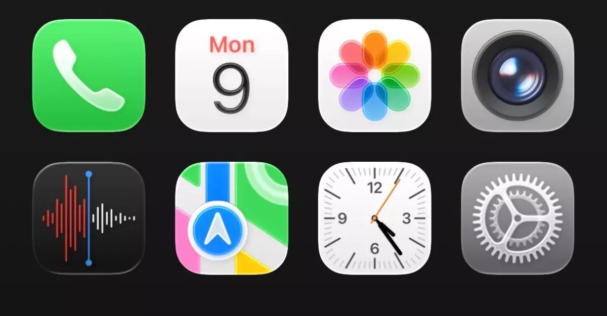
At first glance, Liquid Glass feels almost ethereal, with a mesmerizing blend of translucent icons and shimmering interfaces that seem to float atop whatever backdrop they occupy. This ethereal quality aims to create a more immersive experience, allowing users to glimpse subtle elements of their wallpapers while interacting with various features. However, that initial enchantment can quickly wear off, as the interface’s boldness introduces an unexpected complexity that may overwhelm users. Especially when taking the transition from previous versions of iOS into account, it’s hard not to feel a jolt of confusion accompanied by frustration as the eye struggles to adapt to a design that is as unyielding as it is beautiful.
The Clarity Conundrum: Functionality vs. Aesthetic Appeal
One of my persistent concerns with the Liquid Glass design is its impact on clarity and readability. While Apple is renowned for its commitment to aesthetic integrity, the transparency of icons and controls can lead to a cluttered and visually distracting experience. For instance, the Control Center’s current iteration resembles a chaotic glasshouse where necessary information is obscured rather than enhanced. In an attempt to innovate, the design may risk diluting its core functionalities, a trade-off that can alienate users seeking cohesive interaction with their devices.
Moreover, the oversimplified shapes of elements that were more recognizable in previous iterations have given way to a more rounded, bubbly aesthetic. This shift could provide a playful new feel, but it simultaneously sacrifices some sense of familiarity. Users used to the crisp lines and straightforward icons of earlier iOS versions might find the new interface bewildering. The delicate balance between innovation and accessibility hangs in the balance as users navigate this uncharted territory.
Details Matter: The Balance Between Artistry and Usability
Delving deeper into the elements of Liquid Glass reveals a mix of thoughtfully designed details and noticeable oversights. For instance, the Clock app’s new tab interactions are intriguing, with animations reminiscent of water droplets. Such artistic flourishes demonstrate Apple’s design prowess, yet they may divert attention from the app’s primary functions. The circular buttons that have morphed into ovals also contribute to an uneven user experience, adding to the confusion when interacting with frequently used features.
Even the keyboard has undergone a transformation, marking a departure from its previous iterations. While change can lead to fresh experiences, inconsistently spaced categories in the Settings app, among other areas, may frustrate users accustomed to a more traditional layout. The goal of enhancing user experience is, ironically, at odds with a design that may need more refinement before its official launch.
Embracing Change: Navigating the Future of User Interfaces
Despite the tangible challenges presented by Liquid Glass, it is essential to consider the evolution of user interfaces as an ongoing journey rather than a final destination. As someone who has typically embraced changes in technology, I find myself in a conflicted yet optimistic position. Though my initial response was disapproving, after a few hours with the iOS 26 developer beta, I began to appreciate the uniqueness that Liquid Glass brings to the table. This speaks volumes about the inherent nature of design: It requires adaptation and exploration.
Apple has demonstrated an unwavering commitment to innovation throughout its history. Even as aspects of the Liquid Glass design may appear raw and in need of refinement, the potential for an enriching user experience is within reach. It’s crucial for Apple to pay attention to user feedback and make the necessary tweaks before officially releasing iOS 26. As we navigate this new territory, it is evident that the road ahead will require thoughtful engagement from both the creators and the users. The question remains: Can Apple find the right balance between striking allure and functional clarity in its revolutionary design? Only time will tell.
Leave a Reply